
Most people probably wouldn’t notice. But I did. And it bothered me.
Since launching Ambitious Supply Co., I’ve gone through a few versions of our icon. I love branding — it’s what I live for — but I hadn’t found something that felt right. Every version until now either looked too familiar, didn’t scale well, or just didn’t feel like us. They were close… but not quite.
The latest version finally checks every box I’ve been chasing.
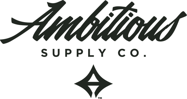
We’re calling it The Ambit — a name that reflects both the scope of our ambition and the visual language we’ve been refining since day one. It’s an abstract “A,” but not in a way that hits you over the head. It’s subtle, balanced, and clean. It pulls inspiration from Palm Springs — from the atomic starbursts and mid-century design elements that define the city’s identity — but it doesn’t scream retro or get lost in trends. And it just works. Embroidered. Printed. Stamped. It holds up everywhere.

More importantly, it actually feels like Ambitious.
This brand started with a passion for design. A love for building, creating, and shaping things that mean something. Over time, it’s grown into something more: a creative outlet, a business, a way of life. It’s moved with me between Michigan and the desert. It’s been built on purpose and persistence. And now, finally, the logo reflects that.
It’s sharp, confident, and quiet in the best way. Like it doesn’t need to prove anything — it just is.
And while it carries a Palm Springs influence, it doesn’t rely on it. The design language is there — the mid-century forms, the quiet boldness — but it’s not locked to one place. It works just as well for someone who’s never been to the desert. It stands on its own.
The last few logo tweaks were just attempts to fix what wasn’t quite working. This one isn’t a fix — it’s a foundation. I’m done chasing it.
The Ambit is the mark.
This is the one.
Now it’s time to move forward. And build.
Still Building,
- Jeremy